This is the follow on from my days 1 to 30 of the Agerbeck Method. The first thirty days are HERE.
Day 31 – Use colour A LOT vs Using a lot of colours
Reflection on this class: I am using very little colour. Being a newbie and very much influenced by the Bikablo books, I have tended to use one colour and black and grey for shadows. More recently and after reading Brandy’s latest book, I have started to use a TRIO, which you can see in my products from this course (bit.ly/AndiAgme). My level of comfort is ultra low, as I have never read up on colour theory. Similarly, my relationship with colour is almost inexistent. My only question is really around combinations of colour. I think this will be answered in the upcoming week or so.
Other key learning…. clown barff is a thing :-)
Day 32 – Your colour history
Activity answers
Q1: love – green, purple, grey // hate – none
Q2: No association of colours with family
Q3: No colour overdose
Q4: Colours in culture / rituals – flag colours: red for dragon, green and white (also for leeks). Yellow for daffodils as it is the national flower. All positive associations.
Q5 – No colour associations with clothes.
Q6 – No work colour associations, nor hobbies
Q7 – no colours for allegiance nor rivals
Q8 – No colours connected personally to ANY feelings
Colour swatch association activity – just don’t connect with colours. Wondering if I am weird.
I think the interesting thing is my complete lack of history or impact of colour in my life. I think I may be weird.
Day 33 – Your colour code
An interesting lesson – I really have very little colour coding. Only two things stand out:
1) File system on my computer – 2018 and live projects have green folders. last years work are Amber and all previous are red.
2) I quite often use red, amber, green for action planning or general planning.
Still reflecting on how else I could use colour.
Day 34 – Hue
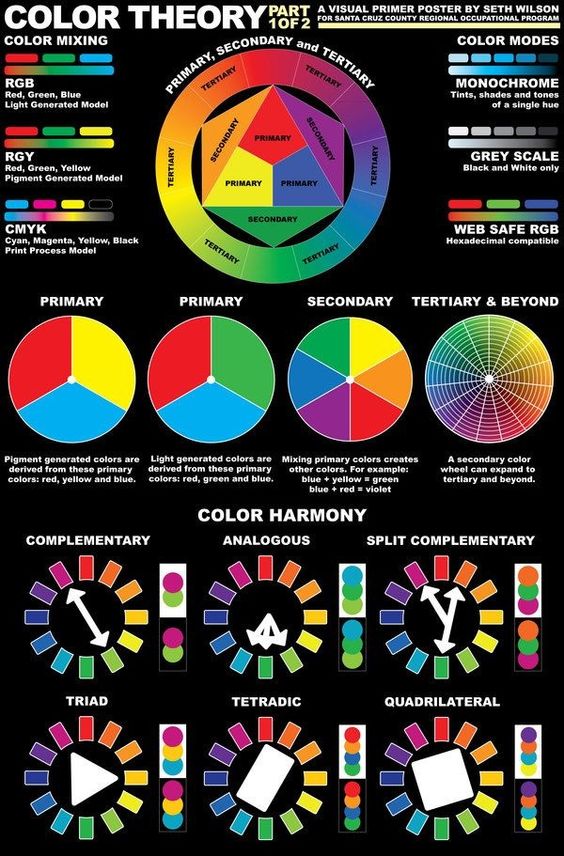
Having never taken any class on colour in my life, I found this really, really helpful. On reflection, perhaps through work and where I have lived, I am certainly attracted to secondary colours. I really appreciate in this lesson the colour wheel PDF and the links to all of the resources. I am now trying to figure out how Neuland put their colour combination sets together as it really confuses me.

Day 35 – Value
The darker colour ranges resonate for me. I must admit, even after a few days I am starting to pay more attention to the colours around me. As I tend to use little colour, value does not really a part in my work currently, except I do like using a lighter / darker colours for some sketchnoting I do. I think colour should become a bigger part of how I work. Value could play a role in emphasis of certain ideas / areas.
Another really interesting class
Day 36 – Colourspotting
have skipped this for now, as it needs lots of time!
Day 37 – TRIO – what, why and how it works
Personally I found this really insightful. Principally because I never really thought of layers of image and how certain tones/hues can focus the attention. I have in the past tended to be very one dimensional in my drawing. I am wondering if my self learning from the bikablo method has created this or if it comes from not studying art at all. Perhaps I am just one dimensional lol.
This great YouTube video shows Brandy doing a condensed version of this and lesson 37. This was taken at the recent EUViz conference. https://youtu.be/N1fuoXhjXlo
Day 38 – Each colour’s function
A really good follow on from the previous lesson. Drawing in this trio way has really got me thinking about dimensionality of the information and questioning myself around “what is important?”. I chose a pretty familiar topic (Simon Sinek’s WHY Ted talk) and this made it a fairly easy activity as I knew what I format was coming up next.
What I noticed – the first layer, black was relatively easy. Deciding what was second or third layer was harder.
What came easily – I noticed that using space became easier, as I could spread out ‘1st layer” information, knowing that the other layers would fill the gap.
What was challenging – haven got into a certain style of sketch noting, this is really pushing me to think about how I use space, key visuals and icons. Some unlearning is required.
39 – tantalizing trios
I really enjoyed all three of these lessons. The theory really made sense and the examples really stand out. I have been using a blue and yellow (with black) for personal work, but I am really aware that on flip charts or bigger the yellow gets very lost. I chose them because I was playing with an iPad drawing app that had the copic colour scheme embedded and I liked one of the blues “process blue – B05”, the app actually recommended the yellow “acid yellow – Y08” as the complementary colour. I then headed off and bought the actual pens and a refill set. A bit like Iulian’s comment in the previous class, I was also using a grey for shadow “Cool grey – C5”, so will play around with your suggestions as a way of removing the grey. The Neuland shop is beckoning, so perfect timing really.
Here are the combinations I purchased at EUViz:

Day 40 – review and reflection
My reflections on the colour section of the course are:
1) A few, previously chosen colours, can have a significant impact on the clarity of a visual.
2) The TRIO concept as a way of layering and organising information is simple yet effective. Particularly if linked to text style (upper & lower case).
3) Colour combinations have a certain logic and appeal and the colour wheel can really help here.
4) The idea of signature colours can be a powerful way of creating a style / brand.
A really helpful module.
41 – Connectors- let’s connect.
From the video, my initial reaction to the connectors was:
A) Related information I.e same set.
B) Stronger relationship of related information.
C) Transversal sharing of information.
D) Loosely connected or low level of connection.
E) Direction of interconnection I.e left bubble flows into the right hand side one.
F) Less clear connection or connection that is difficult.
G) Broken connection or not related information.
H) Unclear or laborious connection.
42 – Limitless lines
I really enjoyed enjoyed this lesson. I use regularly about half of the ‘ambassadors”, but this lesson has given me food for thought about how I can broaden my line repertoire. The other “thoughts” that popped out were 1) being more purposeful about line choices 2) Similar to trios, thinking ahead of time of variations for a capture, would allow me to focus more on the work, rather than more decision making.
43 – Bebe’s Birthday party
This was an ace exercise. It really got me thinking about other things beyond connectors: space, text size, relationships. I am pretty happy with my diagram EXCEPT I used Neuland fineone’s for the first time and A) They take way longer to dry than the copic’s I was using and B) I did not use the outliner black and so there is WAY more smudging than I had hoped.
What I noticed: I had more time to listen and think than I thought I would (way more than say a TED talk). The major topics were easy, it was some of the later, more complex interrelations that were trickier.
What came easily: More like “easier”… major heading and line thickness choices.
What was more difficult: Making decisions around how “deep” to take the lines / depth of conversation i.e. Who is good at what cocktail.

A second version in a generative scribing style:

44 – Contain away
I must admit, I had never really thought consciously about the impact of container styles prior to this lesson. Some I do without thinking: A for something not so clear, C for something solid and F for an idea or insight. I fine “E” quite loud and very attention attracting, and so tend to not use very often. It would make sense to use, to have something really powerful stand out. The lesson also got me thinking about playing with containers, so for example, a light bulb container for innovation / idea or a simple weather cloud for a shared idea / resource. Overall my meanings were similar: D is similar to Kit’s comment for me also: Behind the scenes, hidden, not so clear and partial / temporary.
45 – The 4 Bs
The first thing that came to mind, when I was watching this lesson, was the realisation that I “rush” to contain. I think, on reflection, that leaving information “un-contained” for a while, will allow me to see if what I think is worth containing, really is so AND if there are more powerful ways of making certain information stand out. As an experiment, I am going to see if I can create visual notes and leave the containers until the end. Beyond following a “trio” colour scheme, the containers could also be colour coded i.e. green, amber and red clouds for a decision making session. Like Clydette’s comment – being more intentional will really help simplify and make visuals more powerful.
46 – Wrangling ideas
I do wrangle when facilitating, buy not in a very artistic way and I generally do not label, though may now for added clarity.
47 – The anchor
I found it very interesting to reflect on this lesson. As I reflect on Brandy’s work I see this come out very clearly. A great example being the visual done at EUViz (which also is very TRIO like): https://farm1.staticflickr.com/848/43881491691_2a727052f6_z_d.jpg

I also saw Matthew Magain start his visual of Ben Crother’s session with a blank piece of paper with only a tile and yellow “person”: https://farm2.staticflickr.com/1780/42977200145_8213d5ed1a_k_d.jpg

Do you ever start your drawing in the center of the paper like this?
Initially all of my visuals were like this, as I started taking visual notes with mind maps and they have a core image or words in the centre of the page. Now, I use this occasionally, but more often than not, it is the title in a pretty boring “banner”.
What benefits do you see?
If working live, it may allow me to prep up this significant visual prior to going live. It also provides that really strong centre of attention and does support, radiated and “clockwise” notes.
What drawbacks?
Potentially could use up a great deal of space. Could draw too much attention from the rest of the content as a layer “zero” of content hierarchy. It constrains the work, somewhat, to the two formats / styles of layout.
Overall I like the idea and aim to see how I can add this into my repertoire. As always, it is about appropriateness AND finding ones own signature style.
48 – Blobs & Stems
I really enjoyed this. Playing with the technique, it does seem a quick may of mapping information and creating a clear and visible hierarchy. I used it live at a meeting recently and someone said “That is a nice mind map”. I felt like clarifying the difference between what I had done and a “pure” mind map, but thought the better of it.
49 – Anchor exercise
I had not seen THIS TED video before, so it was a worthwhile exercise just for that. Knowing that there would be four “chunks” of information coming up ahead of time certainly made the planning of the space slightly easier. I am pretty happy with the result. I realise I still need to work on my tex and probably should have used lower case for the third level of information. A good learning experience.

50 – Line review
Wow – what an awesome set of lessons. When I saw these in the course flow, I thought they would probably be the easiest and possibly the least valuable. How wrong I was. Three biggest takeaways:
1) Conscious choice of lines can make a big difference to the clarity and understanding of a visual.
2) Similar for containers really. I tend to just do a blob around a concept. I can know create more powerful containers.
3) Anchor as a key visual element creates focus and provides a solid basis for navigation.
I see I still have a long way to go, but I am certainly feeling more confident in my choices when sketchnoting or using visuals in facilitation or coaching settings. The other thing I have noticed is that this is really bringing “The Idea Shapers” book to life.
51 – Size of ideas – Hierarchy party
What are your thoughts about scale and hierarchy? – No negative issues around the word itself. I think this may be influenced by my studies in knowledge management and systems thinking, where the word is neutral and has no negative connotations. I think scale and hierarchy have a lot of value in creating clarity. I see the challenge as knowing what is what when scribing / note taking “live”. It seems way easier when taking written notes from prerecorded or written materials. I can scan an article and spot the hierarchy, if listening to a talk or video / podcast only one, this is way harder..
Is it a part of visual thinking you feel comfortable with and use? – If I go back to my note taking back when doing my MBA, I basically did all of my notes as mind maps. They are in essence heirarchical, in the sense that the more important ideas are closer to the hub / centre of the page (These don’t have proximity though). In my facilitation work, I regularly use hierarchy to group ideas together, generally via ideas on Post Its, so they can be moved around.
Is it a component you resist or avoid? – Probably avoid but not purposefully, but now I am going through this course, I definitely feel like I am in “conscious incompetence” mode and that there are so many choices at any one time.
Does this idea of who has a voice and how we represent their voices make sense? Can you see the issues of negative heirarchy, power, consensus, and egalitarianism in your work? How do those things show up in your drawings? – No issues at all with the negative side of hierarchy, power and so on.
Day 52 – Scale is not just size
I really liked the way the value can be shifted by scale (size), case (lower versus upper), thicker lines, colour change and containers.
I would imagine that these are decisions made up front prior to visual thinking, scribing, sketch-noting etc.
I think the headings ideas add on to these to produce more examples i.e. underline, grey to make text 3d like or large bullet point.
Day 53 – Scaling images
Again a super useful lesson. I find myself wanting to contain things way to soon i.e. as soon as I have completed some notes on a topic, but I realise I should probably hold off more, as this would allow me to be more flexible or spot opportunities for different ways of using mega containers.
I definitively suffer from a severe case of iconitus :-( I really struggle with using larger images and so this is an area to develop.
I really like the overlap visual at 5:10 and I am wondering how I can use the concept to show the relationship between ideas. Would love to see more examples of this.
Following on from Tony’s post (Sept 13th) – I am finding this course is throwing up more questions about how I work (or don’t) rather than providing answers. This is not a bad thing, but I am genuinely surprised at how much it is making me question how I work and what I can do to improve it. It is also making me more reflective and observant of other people’s work. Awesome!
Day 54 – You-sized – Go BIG to get depth
An interesting class – In my work as a facilitator I regularly use flip charts (but normally in portrait) and occasionally A0 templates. I also use wall space with facilitation cards (via Neuland) or large Post Its. Having said all of that, I do not visually note take, in anything larger than A4 . iPad Pro screen. I have A3 and A1 paper gathering dust in the home office. I must get it out :-(
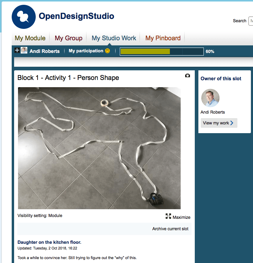
I have just started a BSc in Design & Innovation and one of the activities in Week 1 was to do an outline of ourselves or a family member:
Need to think / play bigger!
Day 55 – Go Small to get concise
I love this – less is definitely more for a lot of my work. When developing materials for leadership or strategy training courses, I used to produce massive decks and participant notes. Now I try and get a full day onto an A3 and key points on to a credit card sized “z card”.
Definitely very tricky to do when doing live sketchnotes. It is definitely easier to do after having done one fuller version of a talk / podcast. I think part of this is the struggle of being taught to take copious notes on everything. The reality is “filtering down” is tremendously useful BUT hard to do. Mentally I am saying to myself “what if I need that information”. I really need to be saying to myself “what is really essential right now?”.
Day 66 – Your Phrenology
I only did a really quick version of this activity, but I really liked it. As an activity it felt fine to do. Normally I mind map my to-do lists or keep them in “Trello”. What I liked about doing this, is that it forced me to make decisions around relative importance / mind share that certain things have.
It actually raised tension as I realised some things are more pending than I say to myself! Probably because I feel like I am spinning so many plates at the moment. It has, even with raised tension allowed to me to create a plan for the next 48 hours to get some good work done.
I can see that this could be a good tool for my visual coaching work.

57 – Pyramid – Up and down the pyramid
An interesting lesson. I went and reviewed a pile of sketchnotes I have made and see, similar to Christine (course participant), that I am not using that many levels. The interesting thing that I noticed, which surprised me, was that the smallest level of text did not actually have more content / usage than one level up. The smallest level was only being used to clarify some of the previous ideas or add an example. I am wondering if that is because of my natural style or if the constraint of A4 paper creates a subconscious filter to use less pyramid levels? Also I am wondering if using full large wall scale paper, this would remain so? Some interesting food for thought.
58 – Chart tour
Very useful to see the examples and the walk through of these. I am very monoline on my sketchnotes, so clearly an opportunity to improve. Part of that is probably being more confident and bolder with central images / wording and the second part I think is I tend to do things fast, so rather than double or triple line something, I will move on. Clearly a few pens of different thicknesses could also solve that.
59 – Create your own key

I really liked the examples in this lesson. I will have a play around this week on the practice builder whilst in hotels, planes and trains.
Again this idea of making choices ahead of time seems really key.
I am wondering whether I should be creating a mini check list that includes things like:
> Trio palette
> Key
> Visual choices: Anchor, containers & lines
60 – Scale – Wrap up
A really useful set of lessons. My key reflection is that there is very little heirarchy in my work beyond bigger title, key themes/headings which are often bolder and then standard text. I really, really need to slow down in order to think through scales / heirarchy and then be comfortable taking longer, so that these ideas are in play in the visuals.
Key gems:
1) Scale and the general concept of it
2) Images and the role that they could play: from giant anchor to mini bullet points.
3) Keys – find ones I am comfortable with for sketchnotes, flipcharts and digital note taking.
4) Practice, practice, practice.
5) View and reflect on the work of visual practitioners with the lens of heirarchy and see how they use the idea.

This is now two thirds of the course, so time for another page on the journey.
Thanks for reading!
What are your thoughts on this....